Overview
Teaching Center is a custom customer relationship management app for the Church of Jesus Christ of Latter-day Saints. The primary focus of the app is to help online missionaries verify product offers and in-person visit requests by visitors to the church's various media channels and websites. In addition the missionaries would also resolve the needs of visitors, answer questions, and teach church doctrine. The end goal was to prepare the visitors to be referred to the local in-field missionaries.
The old form went on FOREVER…
the Problem
How do we make it easier for missionaries to record interactions?
The process to record interactions in Teaching Center was inconvenient for online missionaries. The form was lengthy and there were too many steps for the missionaries to record information about what happened during the interaction. As such the records being passed on were often lacking important information.
user Personas
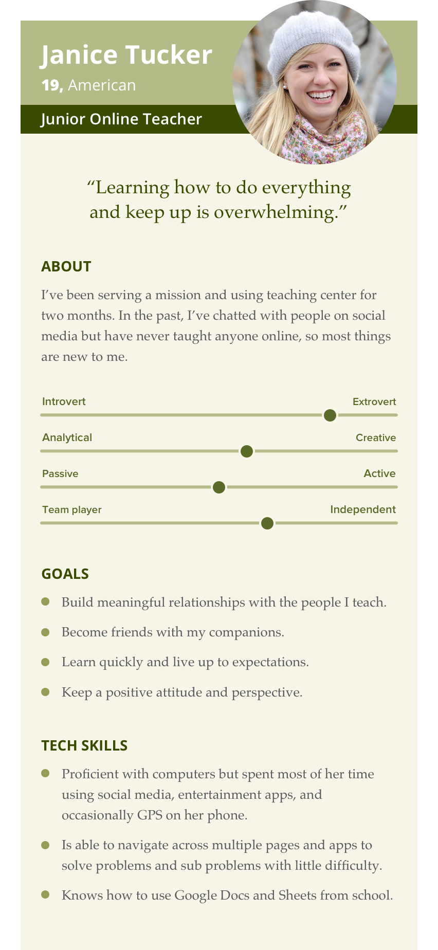
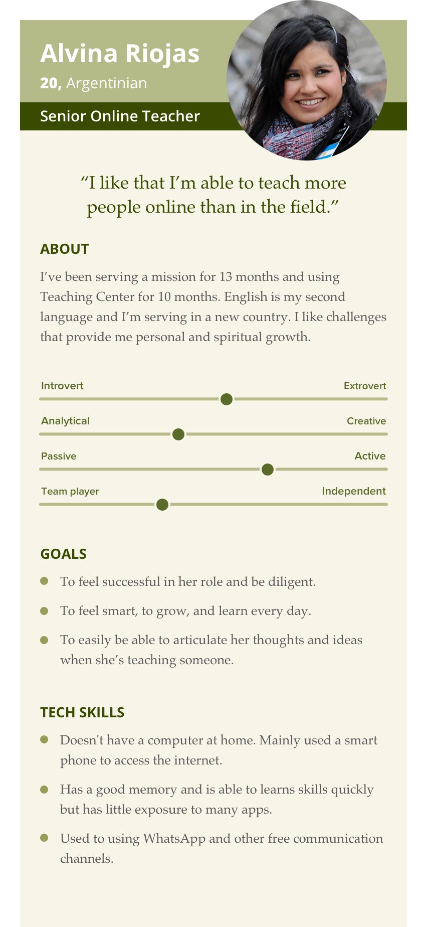
my Role
I was the chief designer on the product but the effort was big enough that I teamed up with another designer to help with prototypes and conduct user interviews and testing. We worked closely with the product manager, lead developer, and functional analyst to work out the business logic necessary to meet the needs of the users.

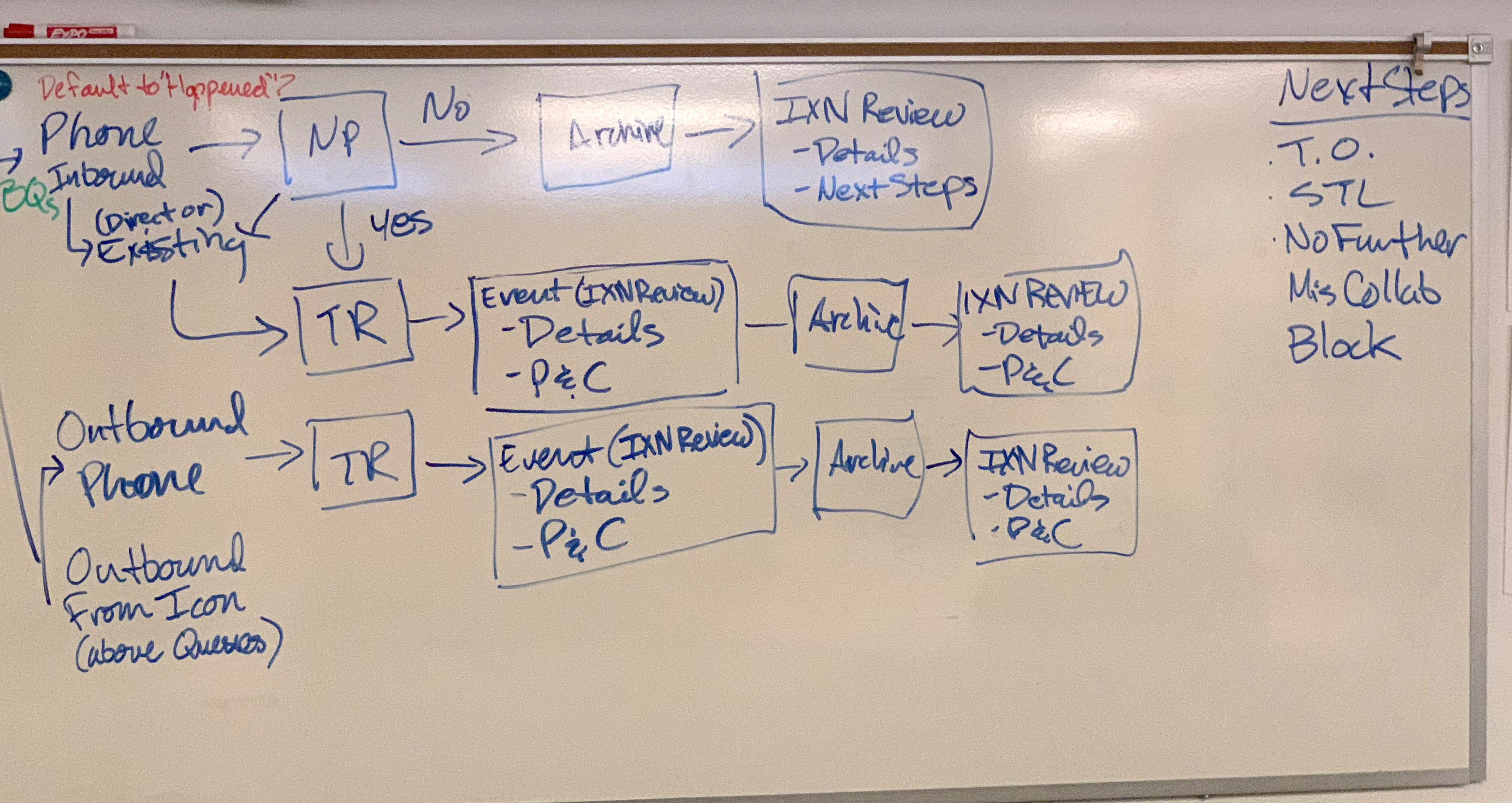
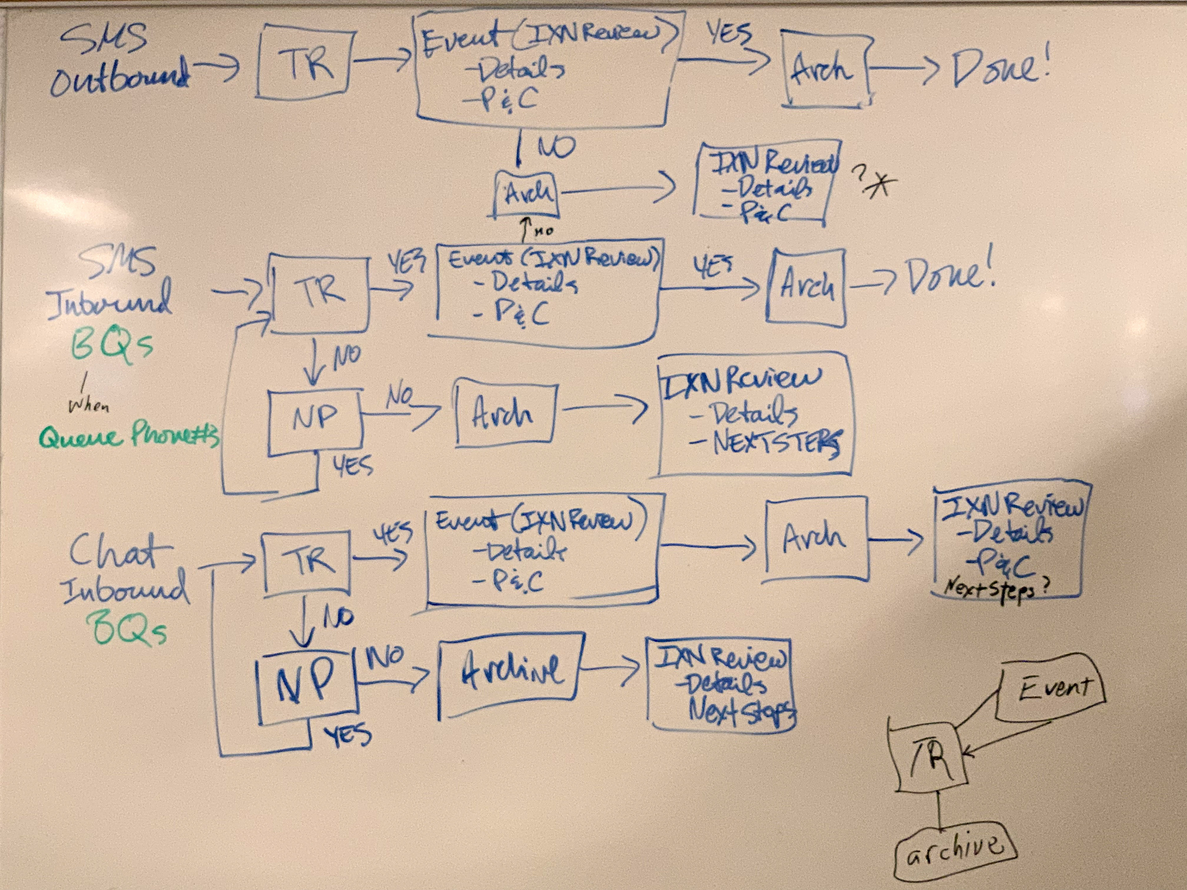
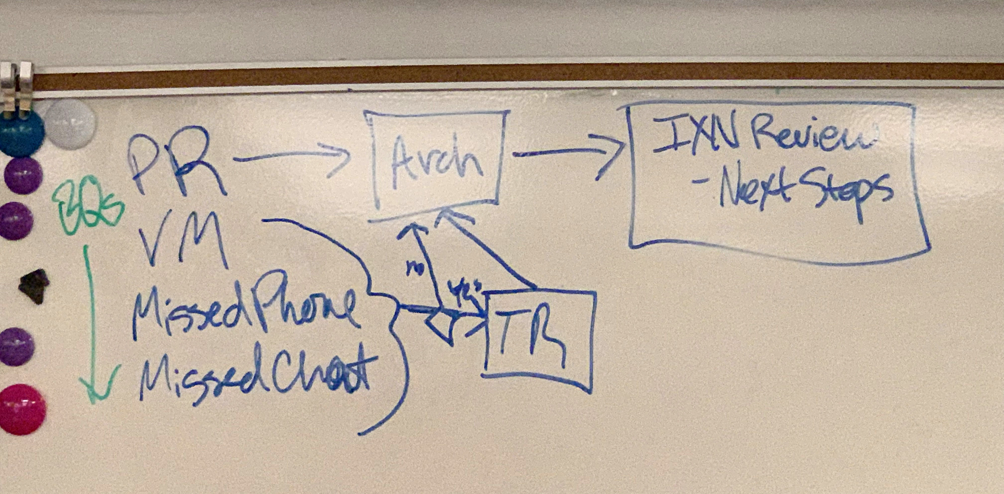
I sketched out scenarios on a series of whiteboards to make sure we had all the workflows covered. So many whiteboards…
Design process
Based on our observations, we knew one way we could make it easier for the missionaries was to auto-populate as much data as possible. For most interactions, the information provided by the visitors would meet the minimum needed to complete the forms. We worked with the lead developers to understand how much information we could derive for every interaction type.
User Flows
Because the primary goal was to remind the missionaries to record what happened during the interaction, we had several checkpoints to be sure they could record at natural intervals. However, we still wanted to keep the workflows streamlined. I mapped out all the scenarios missionaries would go through for all interaction types. Working through all these user flows was extremely helpful as we created prototypes. We also used the user flows to aid in documenting the business logic for the development team.
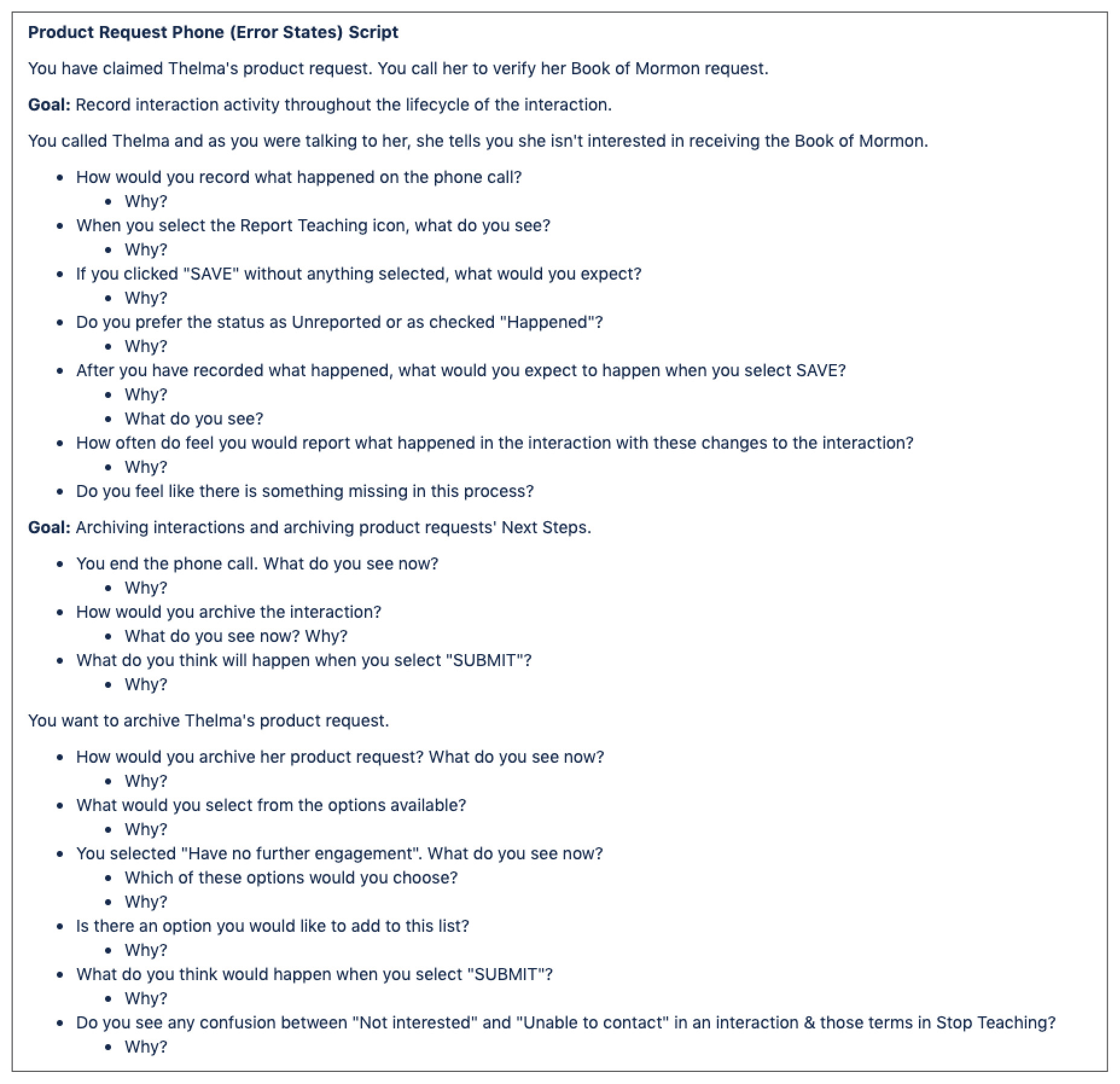
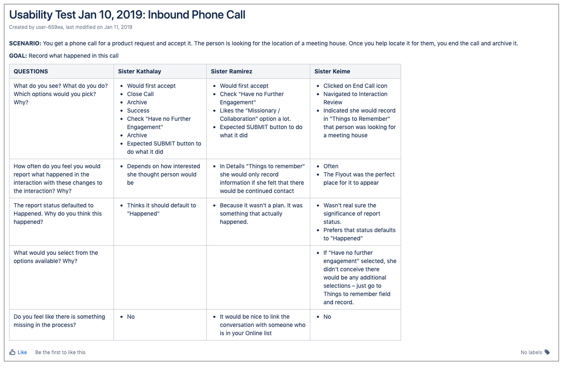
During two rounds of testing, we walked online missionaries through several scenarios to verify the ease of recording events.
Usability Testing
Well, that didn't go so well…
As we began usability testing, it proved to be very challenging, and they weren't working out as well as we had planned. We were trying out some different methods for missionaries to record information during the sessions.
Iterating on what we learned, we made the necessary adjustments and began to get much better results during our tests. The missionaries felt the changes to the user flows proposed were intuitive and made recording information easier.
When in doubt, ask the user.
There was a debate among the team as we were creating the user flows about when missionaries want to record what happened. One thought was the missionaries would only want to record at the end of the interaction, so we didn't need to build a way for the missionaries to record during the interaction. I believed some missionaries would want to be able during the interaction.
During testing, the missionaries were split down the middle, so we decided to allow for both ways of recording. Without testing, we would’ve only built one way of record, making it harder for some missionaries to record what happened, potentially lacking information.
constraints
The project stretched out longer than stakeholders expected. They didn’t anticipate the impact the proposed changes would make on the architecture of the application. I felt we had about four weeks of design and analysis to be ready. They gave us three weeks.
When we pushed the features to development, we ran into challenges due to the complexity of the changes. Working out the changes with the entire team pushed us out a week and was more costly as it happened mid-sprint.
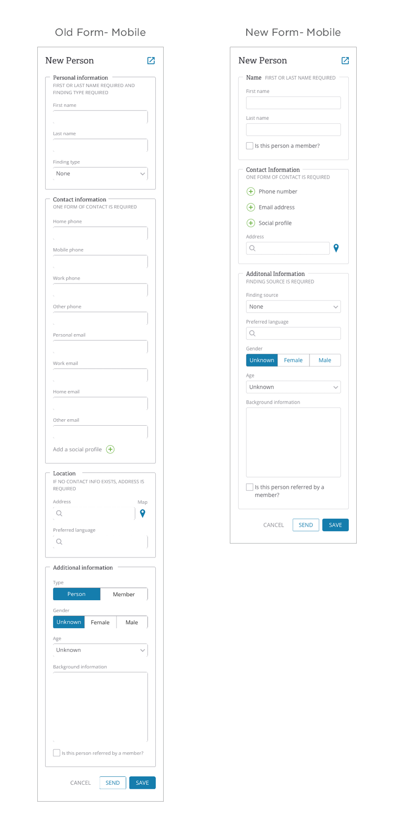
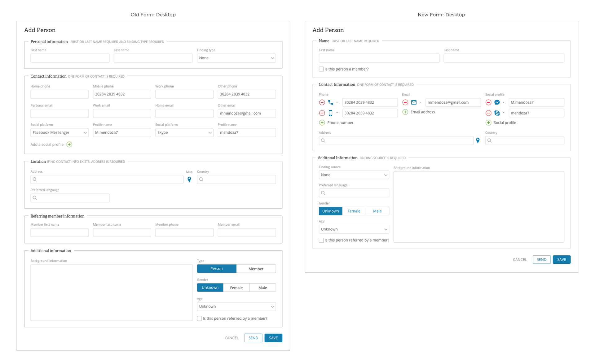
Old form (L) vs. new form (R) minimum width & desktop view
Conclusion
By leveraging online form best practices, the size of the form was reduced dramatically. Important information was more prominent and it required less scrolling. Once implemented, the new interaction workflows resulted in a significant increase in recorded information about interactions.