Overview
A lack of focus and confusing drop-downs makes dealing with referrals an all-day task…
Referral Manager is a custom customer relationship management web app for the Church of Jesus Christ of Latter-day Saints. One of the primary functions of the app is to help referral secretaries in the mission office manage the referrals that were sent to the mission via media sources, missionaries, or church members.The drop-down filters may look cool but they make it really hard to go where you need to go.
the Problem
How do we make it easier to resolve referrals without assignments and follow up with uncontacted referrals?
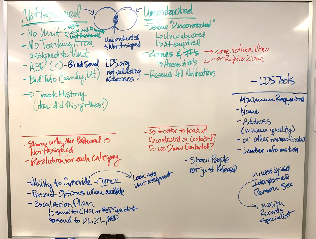
Referral Secretaries primary goal is to view records sent to the mission but not assigned to a specific teaching area so they can quickly determine where to assign them. Their next priority is to know how many uncontacted assigned referrals have been by the local in-field missionaries and quickly view specific zones and areas to contact the missionaries to encourage them to contact the referred people.
The application solved that problem using complicated dropdown input menus that required the referral secretaries to print out lists of the mission organization structure. Missionary assignments could change monthly so they were unable to remember the complex structure. It was also impossible for the secretaries at a glance to know how many unassigned and uncontacted referrals were in the mission zones and areas.
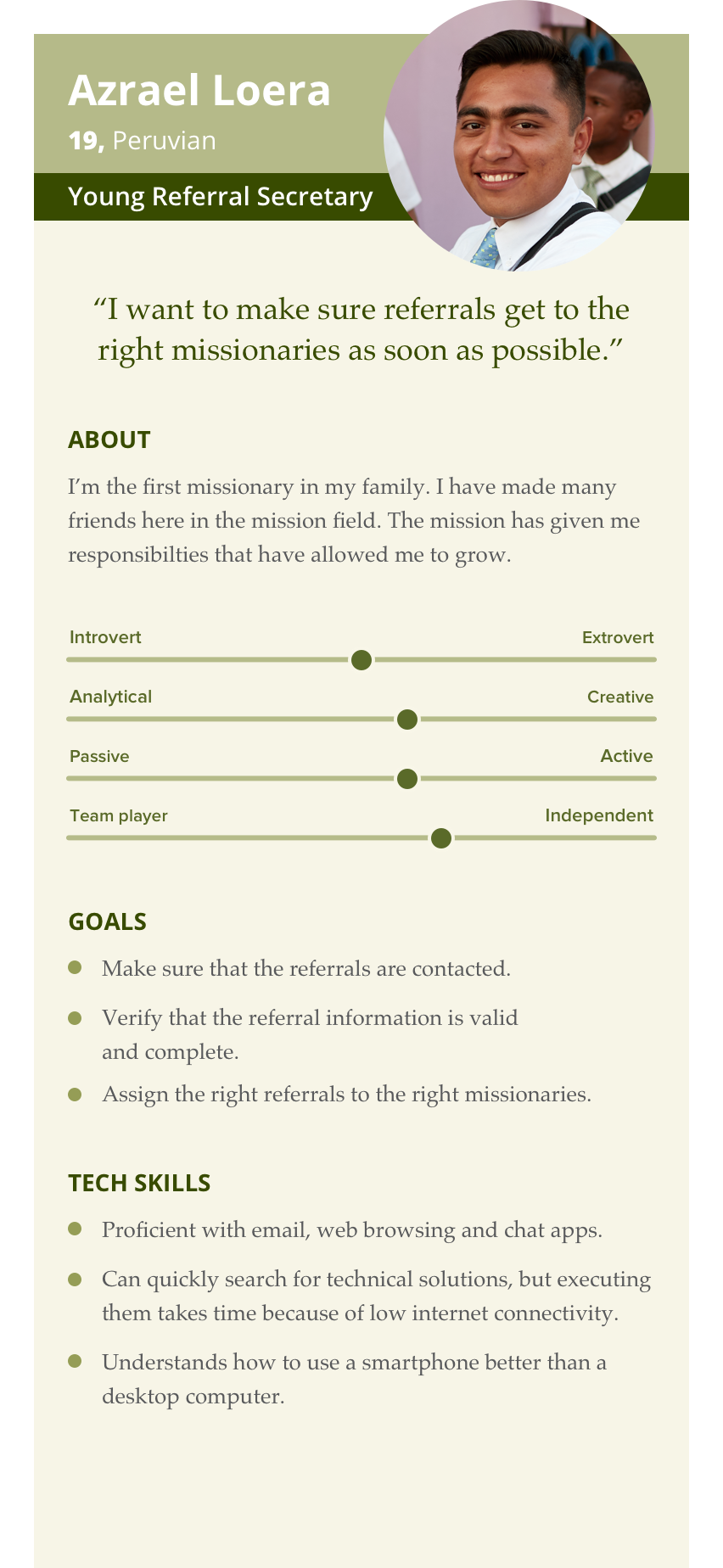
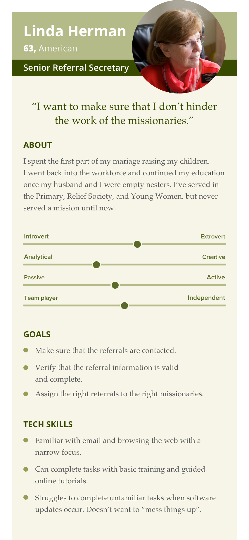
user personas


my Role
Our product manager empowered a small group who had previous experience with the referral secretaries to work together to gather the business requirements. I had interviewed several secretaries to understand their role, I was chosen to be the designer on the team. Our lead developer served as a referral secretary during his mission and our analyst’s mother was currently serving as a referral secretary.


Building a dashboard was only one element of a three-stage deep-dive revision of the referral secretary experience.
User Interviews
We conducted several interviews with referral secretaries to understand what they felt their goals were. We asked them what their biggest pain points were and how they performed their work in the application at the time. From the interviews, it was determined they had two priorities. Their primary priority was to view records assigned only to the mission and determine if they can be assigned the record to a teaching area. After that, their priority was to follow up with in-field missionaries on uncontacted assigned referrals in their zones or areas.
"It's hard to remember all the zones, districts, and areas so I just print out this list every time anything changes…"
It was during these interviews that we observed the dropdown filter menu prevented secretaries from seeing areas needing follow up without drilling all the way down to the area level. Then once they got to the specific area, they'd have to go all the way back up to go to another area. This complexity was frustrating because the mission structure would change every six weeks due to missionary transfers. The secretaries created printed lists of the mission structure every transfer to reference because it was too hard to navigate the filter menus.
Usability Testing
Testing focused on how quickly users could tell many records were unassigned and navigate to the unassigned list. I tested them on whether they could easily tell how many uncontacted referrals were in the mission and if they could easily navigate to the zone and area that had the highest amount of uncontacted referrals.
Despite the testing going really well, nearly all of the secretaries felt we needed to include training resources when the changes were rolled out to help to adjust to the changes. I advised the training team on the new features provided in knowledge base articles during the rollout.
The final solution gave referral secretaries everything they needed to know at a glance.
Results
The dashboard rolled out to a limited group of missions so we could test how the changes were used and what we can do to improve the process. While there was an expected learning curve, secretaries felt the changes helped them more effectively do their work.
Concerns with the changes were expected as this was the first significant change for this user type since the app was launched. As the feature recently launched, we are still gathering feedback and will make changes as we evaluate the feedback.
Rolling out the release to a limited group was successful because it helped stakeholders understand the effects of larger changes across the app. This encouraged more training material for future releases.